Senior Housing taking shape in Downtown Modesto
By Barrett Lipomi
When I see a new construction fence go up around town, I always find myself very curious about what is going on. Too often lately I find myself worrying what will become of that site. I think to myself, I hope it’s not another big box drugstore or chain restaurant. So last spring I noticed a construction fence going up around the former park on 17th and G Streets and found myself feeling this same curiosity. I was happy to find out, however, that the project on that site wasn’t another discount big box retailer, but rather was a new affordable senior housing complex. Modesto hasn’t seen a housing project in downtown for decades, so I was very excited to see this becoming a reality.
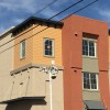
The project, managed by Beacon Communities, is called Tower Park, giving a nod to the history of the site which formerly housed a large iconic water tower. The L-shaped building sits right up against the sidewalk on both street frontages freeing up the back portion of the lot for parking and any outdoor areas. The three story structure is now nearing completion on the exterior. The design of the building is contemporary, yet also incorporates some traditional detailing and materials.
We often judge architecture by what we see of the materials and what we see on the surface. As such, this building has very familiar surface materials for most of us as it is clad with stucco, tile, and horizontal siding. What often isn’t discussed is the function, context, and proportions of buildings. In multistory apartment projects like this with identical stacked floor plates it is always a challenge how to articulate a large blank wall with equally spaced windows on each floor. The architect in this case incorporated full height pilasters that pop out from the building and cant outward towards the street at when they reach the top of the structure. These vertical elements draw the eye upward and also provide rhythm to the façade. Although I would have preferred the building be painted the color scheme shown on the Tower Park website, it does still feature a five color paint scheme that helps to further break up the massing.
This design is certainly not the progressive architecture that I would personally prefer to see, but I understand the budgetary restrictions and limitations that go along with a project of this type. So given this context, I think it is well executed project. I’m still holding out hope for modern lofts to rise up within our downtown core, however this project is a positive addition to our downtown and a step in the right direction.


