DesignView
Modesto is not only a city. It’s a font.
by Lee Davis, Founder, Modesto Design School
Every letter of every word you’re reading here has been designed. Each character of every font has been meticulously drawn by a typographer to ensure legibility, to be aesthetically pleasing, and to convey a style or symbolic meaning.
If you were to design a font inspired by Modesto, what would it look like?
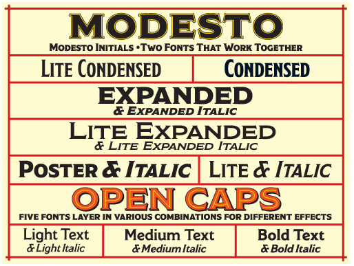
Acclaimed magazine and newspaper typographer Jim Parkinson did just that. In 2001, he designed a font family named after and inspired by Modesto. Born in Oakland, Parkinson started as a lettering artist for Hallmark Cards in 1964 where he learned his craft from leading type designers, including renowned German typographer Hermann Zapf. When Parkinson returned to Oakland in 1969 to create his own studio, he was already an accomplished designer specializing in hand lettering and typographic logos. Most Modestans have probably never heard of Parkinson though his work is ubiquitous. He created or refreshed iconic logos and nameplates for Billboard Magazine, Chicago Tribune, Esquire, FastCompany, Los Angeles Times, Newsweek, Rolling Stone, Variety, Wall Street Journal, and Washington Post, to name a few.
Parkinson infuses his type designs with a retro sensibility often inspired by old wood type and signage.Several of his typefaces are named after California towns (e.g., Amador and Fresno). But Parkinson’s Modesto font has particular personal significance to him. His grandfather, Lowell Gum, grew up on a farm near Hanford, worked at the Modesto Creamery, and lived in Modesto (near the McHenry Library) until he died in the flu epidemic of 1918.
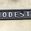
Parkinson’s Modesto font is based on a signpainter’s lettering style popular in the late 19th and early 20th centuries like that on the old evaporated milk cans from the Modesto Creamery where his grandfather worked. Parkinson’s Modesto font evolved from lettering he created in the 1970s for the iconic Ringling Bros. and Barnum & Bailey Circus.But he took his initial inspiration from the lettering on Modesto’s train station. According to Parkinson, “I took a snapshot of the lettering on the Modesto train station several decades ago and modeled the [Modesto] typeface on that lettering.”
Who knew?! Why are so few people aware of our rich design history and heritage? How might we foster a creative culture in Modesto that values design, invention and innovation? Modesto could be a creative capital. To start: not many cities can claim themselves a font namesake. But we can. And that’s nothing to be modest about.
www.typedesign.com


